The third developer betas of Apple’s 27 OSes dropped today, and this new page in Apple’s developer documentation drew my attention — a built-in Uniform Type Identifier for Markdown data:
UTI:net.daringfireball.markdown
Conforms to:public.utf8-plain-text
I had previously recommended conforming to public.plain-text but stated that the text encoding should be UTF-8. I’ve updated my own recommendation to public.utf8-plain-text to enshrine the UTF-8 encoding. (Back in 2004 UTF-8 support was far from universal. Today it is.)
On Friday, June 12, the US government applied export controls to
our newest models, Claude Fable 5 and Claude Mythos 5. This
required us to restrict access to foreign nationals, whether
inside or outside the United States. Because the order took effect
immediately and we had no reliable way to verify nationality in
real-time, we suspended access to both models for all users.
As of today, June 30, the export controls on Fable 5 and Mythos 5
have been
lifted.
Over the past two weeks, we have worked closely with Anthropic to
analyze and approve Fable 5 to ensure alignment across the US
Government and strengthen America’s leadership in AI.
I don’t think a goddamn thing happened in the last two weeks, and if anything did happen, it sure as shit wasn’t anything that Lutnick understood. There should be real government oversight regulating frontier AI, but this is just pantomime performative nonsense.
The entire Trump 2.0 term (and much of the 1.0 term before it) can be summarized with a single word: kayfabe, “the tacit agreement between professional wrestlers and their fans to pretend that overtly staged wrestling events, stories, characters, etc., are genuine”. Trumpism and MAGA is entirely about the belief system that everything is bullshit. Everyone is crooked, every supposed fact is merely an opinion, and everything is ultimately subject to the whims of whoever has power. The fix is not just in, it’s always been in, and always will be in. What Trump says is true is true because he’s the fucking president. Trump himself asserts that “evidence” is what he claims to see — not what he can actually show for others to see. If Trump says we won the war he needlessly started with Iran, then we won it. If Trump says there’s a peace deal 38 times, then there have been 38 peace deals. The FIFA “peace prize” Trump was awarded last year was no more legitimate or earned or meaningful than a WWE championship belt. It’s pro wrestling not just writ large, but (alas for the entire world) writ very large.
When you view Trump and his administration through the prism of kayfabe, it doesn’t make actual sense, but you can see how they think it makes sense.
I’m not accusing Anthropic of being in cahoots, per se, with the Trump administration on this whole “Fable is so good that it’s too dangerous ... wait two weeks ... OK now everyone can have it” back and forth. But they played along. “The AI model the Trump administration didn’t want you to have” is advertising no money could buy.
So 8 to 10 years or so after the political blogosphere invented the kayfabe metaphor for Trump and eventually tired of it, Gruber has had an epiphany? He really needs to stop writing about politics and stick to Apple.
Steven Spielberg, on The Rest Is Entertainment on YouTube:
I approached Cubby Broccoli after Jaws was a big hit. I’d always
wanted to make a James Bond film from the day I saw Dr. No, so I
called Cubby after Jaws and volunteered. I said, “If you need a
director, I would love to direct one.” And he said no. And he
moved on.
And then Cubby called me again after Close Encounters came out.
And that was a big hit. And Cubby called me a few years after
Close Encounters and said, “We’d like to use the five notes in
Moonraker.” And I said, “I’ll make you a deal. I’ll give you
permission to use the five notes if you let me direct a Bond
film.” And he said “Nope.” But I gave him the five notes anyway.
In Moonraker, the iconic Close Encounters notes are the passcode to the locked door of a secret lab that Bond (Roger Moore) needs to enter. Probably not so secure to play the passcode digits audible, but it’s a fun Easter egg. I always presumed that EON used it as fair-use homage, without bothering to ask Spielberg or Columbia Pictures for permission.
Spielberg, in his interview with The Rest Is Entertainment, goes on to explain the oft-repeated story that his disappointment over his rejection by Broccoli led to his collaboration with George Lucas to make Raiders of the Lost Ark, which I put on my short list for best movie ever made. The whole opening sequence of Temple of Doom — where Indiana Jones is wearing a dinner jacket and chaos erupts at a nightclub while Jones chases a vial of poison antidote while the other characters chase a diamond being kicked around the floor — is more Bond-like than most Bond films. (Oh, and that Shanghai nightclub’s name: Club Obi Wan. No need to ask permission for those five syllables.)
The 1820s and 1830s shared another linguistic fad with today: an
appreciation for deliberate misspellings. (Kewl, rite?) This
trend, which had humorists adopting now-cringey bumpkin personas
with ignorance manifested in uneducated spellings, turned no go
into know go and no use into know yuse (lol). Abbreviations
were not immune, and no go became K.G.. So too all right
became O.W. , as an abbreviation for oll wright. And all
correct became o.k. , as an abbreviation for oll korrect.
Although OK became one of the more commonly used initialisms, it
might have passed into oblivion when the linguistic fad had passed
if not for the presidential election of 1840, when Martin Van
Buren was given the nickname of “Old Kinderhook” because of his
hometown of Kinderhook, NY. The Van Buren stans who joined “OK
Clubs” nationwide were themselves, they proclaimed, “OK.” Their
campaign was memorable enough to have both popularized the word
and to have hijacked the story of its origin: there are today
still those who believe that “Old Kinderhook” is the original
meaning of OK.
I have a strong preference for OK (perhaps infused by the classic Macintosh Human Interface Guidelines’s adamance on the spelling). Okay is OK in prose, but never as a UI button label. Ok and ok are not OK.
Berber Jin, reporting last week for The Wall Street Journal (gift link):
OpenAI is planning to unify its ChatGPT app, coding platform Codex
and browser into a desktop “superapp,” a step to simplify the user
experience and continue with efforts to focus on
engineering and business customers.
Chief of Applications Fidji Simo will oversee the change and focus
on helping the company’s sales team market the new product. OpenAI
President Greg Brockman, who currently leads the company’s
computing efforts, will help Simo oversee the product revamp and
related organization changes, an OpenAI spokeswoman said.
The strategy change marks a major shift from last year, when
OpenAI launched a series of stand-alone products that didn’t
always resonate with users and sometimes created a lack of focus
within the company. OpenAI executives are hoping that unifying its
products under one app will allow it to streamline resources as it
seeks to beat back the success of its rival Anthropic.
This sounds like an utter disaster in the making. Would it make any sense for Apple to merge Safari, Messages, and Xcode into one “superapp”? No, it would not. It makes no more sense for OpenAI to merge ChatGPT, Codex, and especially Atlas together. I use and very much enjoy ChatGPT because its Mac client is such a good Mac app.
Simo came to OpenAI by way of Shopify and Instacart, so it doesn’t surprise me that she sees OpenAI’s existing product-first culture of creating well-crafted native apps as a problem, not a strength to build on. If this “superapp” plan is true, it’s going to tank everything that heretofore has been good about ChatGPT and Codex.
Well, of course, what they're trying to do here is something akin to WeChat in China. A platform which aggregates value on top of the OS platform. I don't have any faith OpenAI will pull that off, though.
My recent rumination about “The Greatest Invention Is…” triggered some thinking around my long-held beliefs about the duality of technology. It left me brooding over the weekend about the present and the future. I started going through my notes and came across two separate entries with my thoughts on “stuff” I had accumulated during my research and reading adventures. They helped connect a few dots.
“Optimism is a strategy for making a better future. Because unless you believe that the future can be better, you are unlikely to step up and take responsibility for making it so.” — Noam Chomsky
I think I flagged that quote because Chomsky is the last person I would have labeled as someone who leaned into future and progress. Under his quote, I had these questions spurred by his words:
What is dystopia?
What is technology?
What is progress?
What is society?
What is civilization?
And my answers.
It’s nothing if not all a moving target. It is about change. Eventually, the present becomes a future normal. The imagined future simply becomes reality. If you are a long-time reader, you know my personal disposition towards such thinking. And I noted as much in my second note.
I had written some thoughts around various snippets from Hind Swaraj, a book by Mahatma Gandhi, originally published over a century ago. He was writing about a future that is now all too present around us. He was addressing similar if not the same social injustices that are often discussed today. He was not writing about India. His was a critique of the entire West and what civilization was becoming as a result.
The upside of reading books from a century ago is that you can see how our lived history has panned out, and how much of what was an imagined future has become reality. Gandhi’s book is a good narrative tool. It is not about technology, but about society as it was changing due to the rise of new technologies. There is a strong parallel to our present. In a sense it gives us a hundred-year arc on the human condition.
As a society we are now imagining a future that is more abstract, more dystopian, and more full of anxiety. Gandhi and his peers might have felt the same over a century ago. Should we feel the sense of overwhelming anxiety and dystopian despondency, or should we take a “roll with it” approach?
The parallels in Gandhi’s book with today are shocking and amusing at the same time. What he fretted about feels so quaint, normal and routine now. His writing from a century ago only reinforces that we have an ever-changing idea of what is reality, what is a perceived future, and what eventually becomes the future.
With the hindsight of the near history, and if you squint, you can see our “smartphone present” in the description of the future Gandhi wrote about:
“It has been stated that, as men progress, they shall be able to travel in airships and reach any part of the world in a few hours. Men will not need the use of their hands and feet. They will press a button and have their clothing by their side. They will press another button and have their newspaper. A third, and a motor-car will be waiting for them.”
I use my phone to have my dry-cleaning picked up and dropped off. We can fly anywhere from anywhere in less than a day and make all the arrangements on our phones. News via the internet. Uber is nothing but a car on demand. Somewhere in his book, Gandhi notes that “Civilization seeks to increase bodily comforts, and it fails miserably even in doing so.”
Thanks to the gift of hindsight, I have a tough time reconciling with that logic. While it might not be true for all humankind, we have seen bodily comforts go up, through our ability to turn dead dinosaurs into things that can be used, or are useful, and are utterly pointless. Sure, we are killing the planet in the process — an irony not lost on me. We are becoming dinosaurs ourselves, hopefully to power some future Labubus.
The meta point is that now that we are indeed a button-pushing society, how long before this lack of friction starts to erode what could be described as human capacity? We will forget what it is like to do something ourselves. Just look at how we use our navigation systems as a crutch. It has already eroded our sense of direction, and the meaning of place. Location has been abstracted into the tiles of a map.
“Formerly men were made slaves under physical compulsion; now they are enslaved by the temptation of money and of the luxuries that money can buy,” Gandhi wrote.
What was described as “temptation” a century ago is now bare necessity. Gig workers are not driving for comfort, but for rent. It is estimated that there are over a billion gig workers worldwide. Most of them combine gig work with other jobs because neither alone covers the bills. The past is now reality, just in a different form.
As I re-read my own notes and highlights from Hind Swaraj, a few other important bits stood out. “There are now diseases of which people never dreamed before, and an army of doctors is engaged in finding out their cures, and so hospitals have increased,” he wrote.
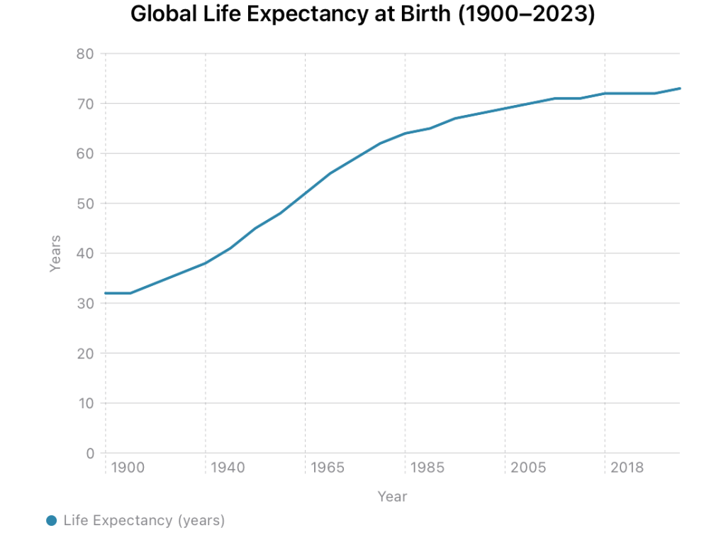
At that time, what he wrote probably felt like a futile exercise. But was it? In 1900, the average human life expectancy was thirty-two years. Today it’s seventy-three. We more than doubled it in a century. Finding cures is progress. That’s real and measurable.
But of course, with change come new diseases of modernity. Diabetes, heart disease, and growing incidents of cancer. The number of adults with diabetes worldwide quadrupled from 108 million in 1980 to over 580 million today. We engineered a food system for convenience and then built a trillion-dollar pharmaceutical industry to manage the consequences. Ozempic is a perfect example of a technology fix for the damage wrought by the system we built for comfort.
Progress? Dystopia? I’m not sure. The duality of technology is always there. As Robert Louis Stevenson wrote of Jekyll and Hyde, we are “radically both.”
Of course, nothing showcases the excesses of technology like communication systems. Always has. From carrier pigeons to mail trains to the Internet, communication and the ability to communicate have been disruptive and disturbing.
“Formerly special messengers were required and much expense was incurred in order to send letters; today anyone can abuse his fellow by means of a letter for one penny,” he wrote, adding, “True, at the same cost, one can send one’s thanks also.”
I bet even he didn’t think we would end up with Twitter, TikTok, and Instagram. Great tools for communication and amusement. But also tools for selling a story, not simply telling one.
As a society, now, we are staring at a hazy new future. We are living in the petri dish of tomorrow. People talk about AI as jobs lost and “existential risk.” Our challenge is a lot less complicated. Passivity. Not the headline stuff, but quiet subjugation. Convenience, subsuming us, one bit at a time.
Gmail finishes your sentences. Spotify tells you what to listen to. Amazon reorders your toothpaste. Small things. Tiny bits of surrender in the name of comfort. You didn’t choose the words, the song, the brand. The system became the arbiter. Passivity by a thousand defaults. No longer Gandhi’s button-pushers — something less than that.
And now here comes AI with its agents and assistants. Every startup says they will book your travel, manage your calendar, draft your emails, handle your shopping. You won’t even need to lift a finger. Just let the system learn your patterns and act on your behalf. That’s not a tool. It’s a replacement for choice and choosing. Passivity for the next century. We will call it progress. But is it progress, or is it dystopia?
Any conclusion we arrive at today is not relevant. Gandhi laid out his idea of the future of society with clarity. I can’t say if he was right or wrong about his warnings. As someone who is predisposed to looking at the future, I see it as progress. Not dystopia. Whether it’s progress or dystopia depends on where you stand.
Let me close with Chomsky’s words: “Unless you believe that the future can be better, you are unlikely to step up and take responsibility for making it so.” I think it will be better. I am sure someone a hundred years from now will crunch the numbers and let future versions of fellow humans know.